Lime Venue Portfolio
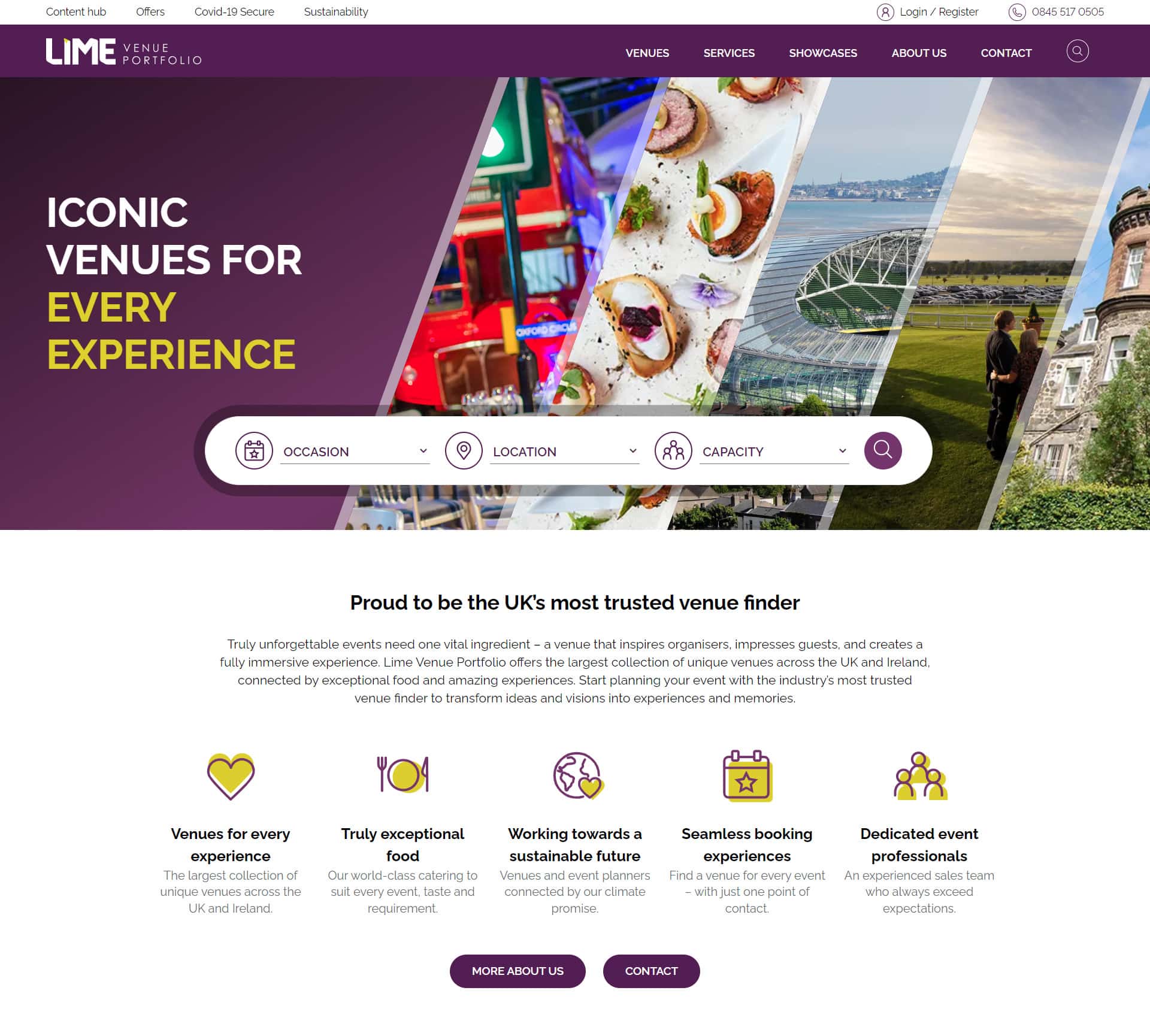
A new, greener, faster and personalised site for the UK's most trusted venue finder.

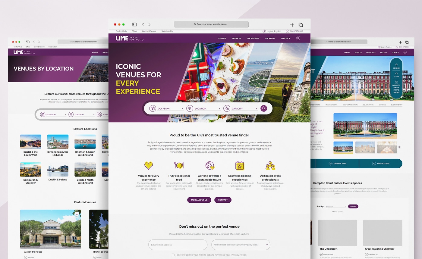
Lime Venue Portfolio (LVP) is the UK’s largest collection of iconic venues. Six months after the launch of their new website LVP saw their best performing months for venue enquiries – ever. That’s not all…
- 110% increase in overall website conversions.
- Each webpage on average is now generating 0.36g of carbon. A reduction of approx. 9g.
- Greener than 84% of webpages on the web (sampled by websitecarbon.com).
_
The challenge
With a collection of some of the UKs finest venues, LVP wanted to increase visibility online and modernise the process that users take to discover and then book venues from their impressive portfolio.
The approach
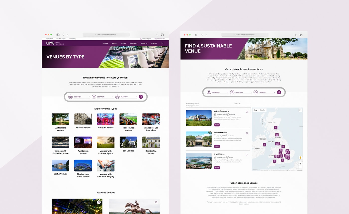
At it’s core, for the site to succeed and meet the requirements of the key stakeholders, the focus was put on showcasing the venues in all their glory and make it simpler for a user to find and compare venues. Discoverability was improved by better grouping venues and providing better live filtering which eased UX and navigation.
Features include
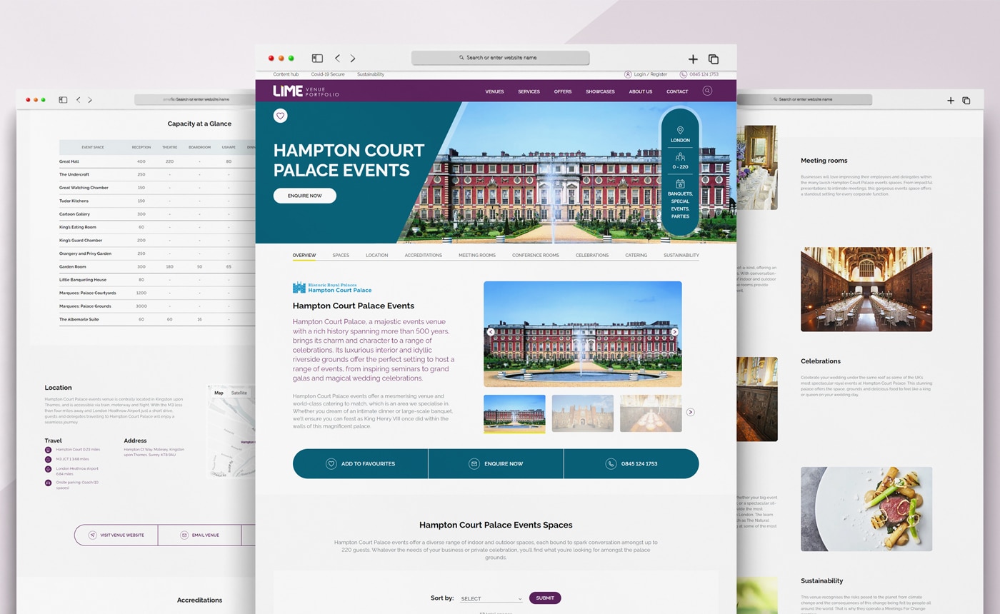
- Filtering – functionality that gives the user control to constantly update and adapt their venue search.
- Custom Venue Pages – Each venue page feels unique with custom colours to reflect their brand.
- Account Feature – Account areas for users and agents to manage and track venues that are of interest.
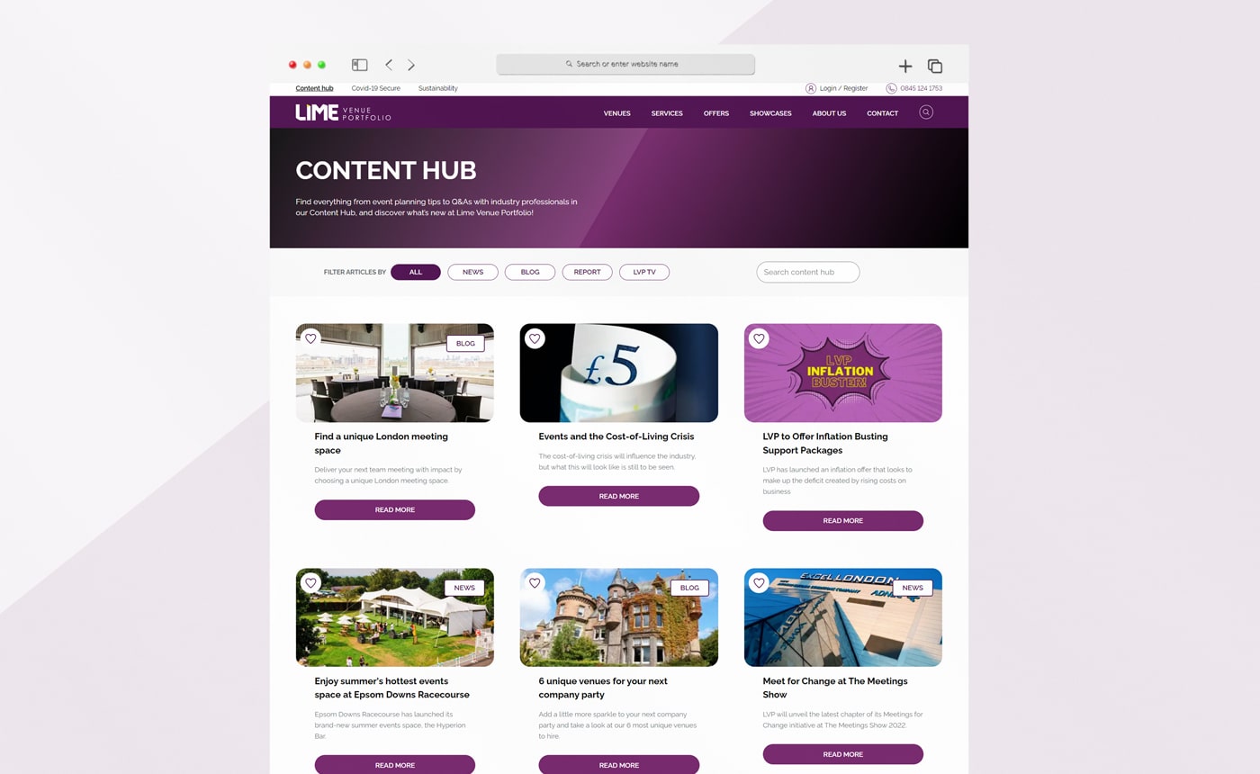
- Favourite feature – The ability for users to save venues, reports and blogs to their account for easy comparison and reviewing later.
- Personalised and tailored content – provide account users with dynamic content based on location and their favourite venues.
- Visually Rich Imagery – Shining a light on venues by showcasing their best imagery across the venue pages.
- Custom Maps – Styled maps and pins to fit with the brand.
_
Art Direction
We made the decision early to strip back the design so that the focus of the user was on the venue detail. With a cleaner modern UI, the experience becomes more relaxed with less content vying for attention. Ample spacing, rounded corners and warm soft colours all contributed to making the space feel more inviting and breathable.
The design also takes into account the modular structure of the website which allows for blocks to be re-used consistently and moved without feeling at odds with the rest of the page.
_
Sustainable Development
We introduced a number of measures as part of LVP’s ‘clean and green’ marketing approach is in line with the company’s commitment of reaching Climate Net Zero by 2030.
- All imagery used is the optimised WebP format.
- SVG icons were designed and used over image files.
- Images also load lazily.
- Fonts were optimised.
- Scripts were limited and kept lean.
- Coded from scratch without unnecessary frameworks or libraries to avoid bloat and bulk.
- Hosted on a green server running Renewable Energy.
_
Showcase
_

_
_
Credits
Agency: Pretty Pragmatic
Directors: Nick Davies, Alana Griffiths
Technical Director: Rob Lowe
Account Manager: Kathrine Wooltorton
Backend Developer: Barry Fogarty
UI and Icon Designer: Nicola Webb
Copy Writer: Tyler Curtis
Content Management: Max Gorst