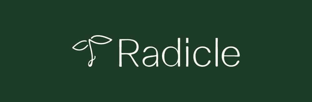
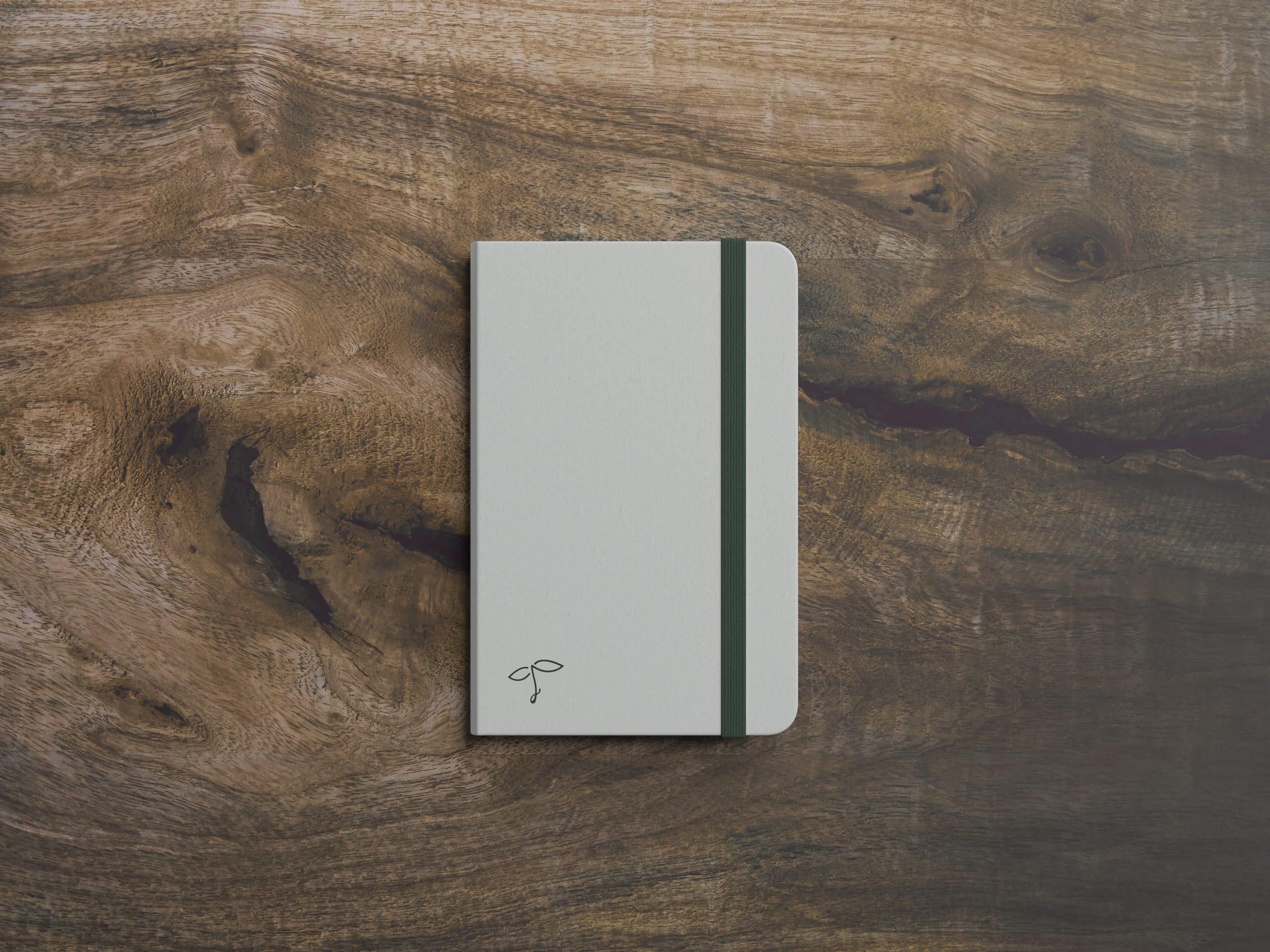
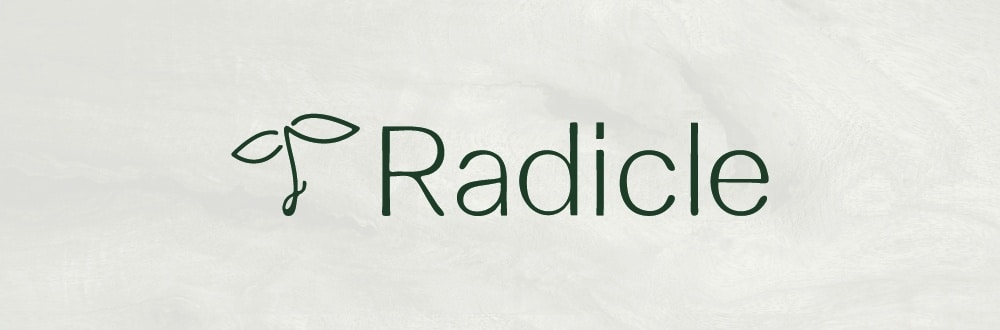
Radicle
Identity design for a sustainable architect.

The final stage in a seedlings germination process is the emergence of the Radicle, the first root from which the seedling will begin to grow. It is at this stage the seedling begins to develop in symbiosis with its environment.
Who are Radicle?
Radicle is an architecture firm specialising in sustainability and low impact structures. They work primarily with natural materials such as straw, clay, hemp and timber.
The challenge
Design a logo and develop out branding that will reflect the core values of sustainable architecture. These include conservation, waste reduction, protection and enhancement of ecosystems and safeguarding the future. Radicle want to make sustainable architecture the norm.
The brand should avoid corporate architect typology and not follow the grain when it comes to looking like a traditional architecture firm ‘wearing a suit working for rich clients on big luxury homes or shopping malls’.
_
The approach
Drawing on inspiration from natural and organic shapes, I explored Art Nouveau and the Arts and Crafts movement. The logo needed to distance itself from the corporate world and instead reset the playing field of how an architect should look. We wanted there to be a friendly, honest feel in the identity reflecting nature and combining this with a simple minimal freshness.

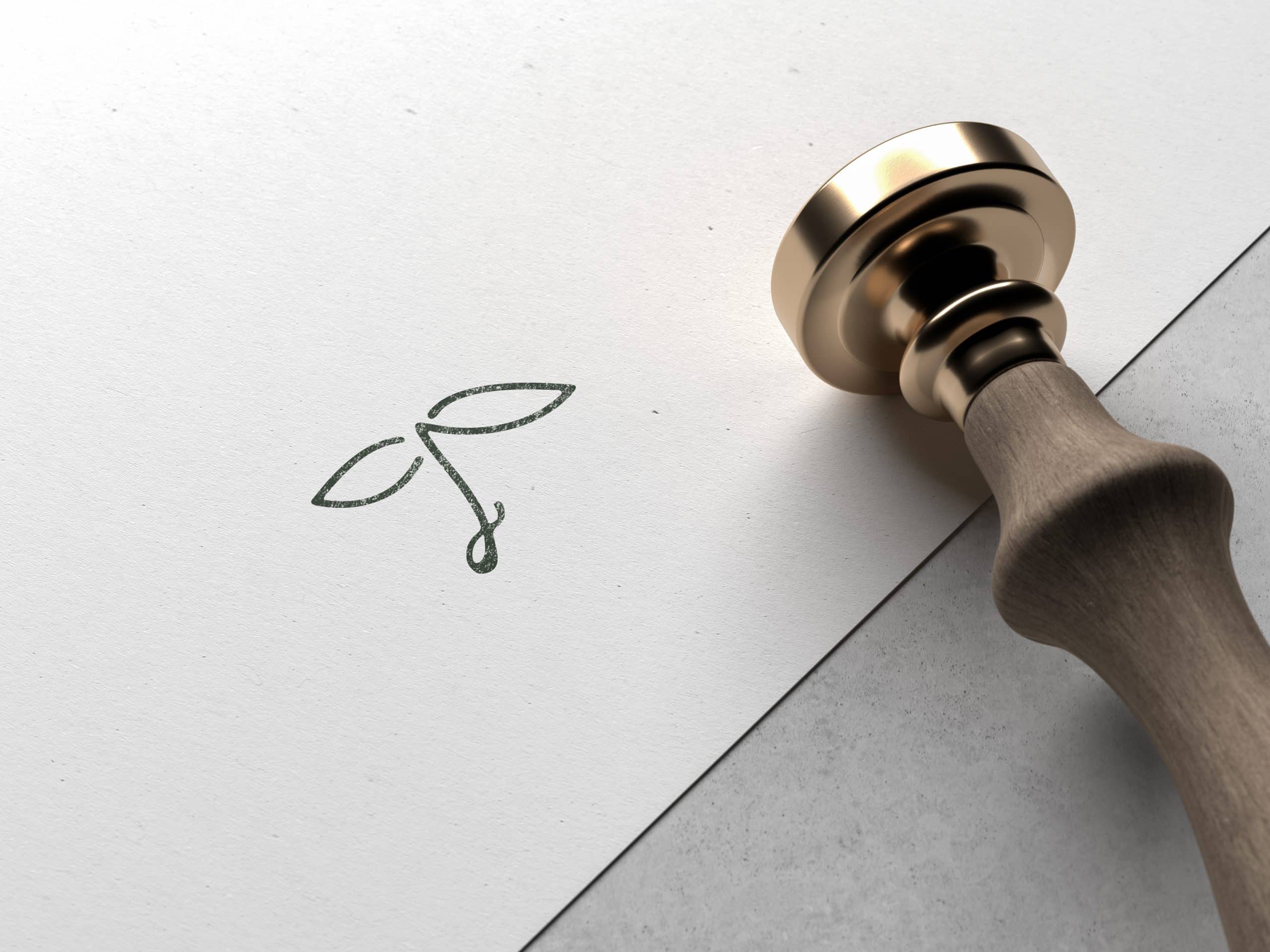
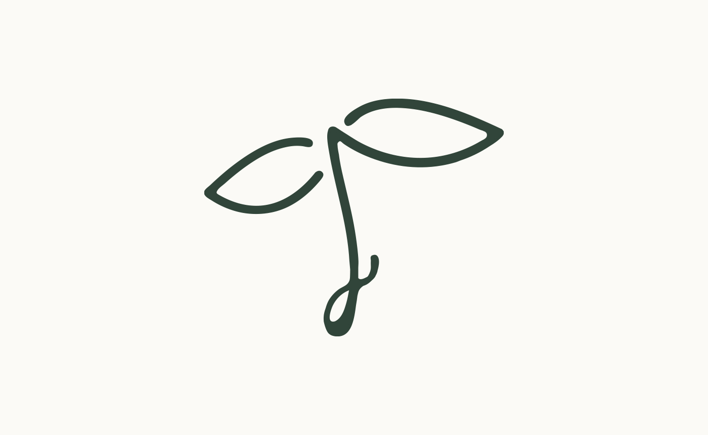
The symbol
At the bottom of the symbol features a seed-like shape with a sprouting radicle emerging and growing. Care has been taken to balance the symbol so that it’s not top heavy or uneven. The thickness of the radicle seed-shape is countered with a thicker and consistent line-width throughout the symbol.
The radicle sprout is in the upward position which represents growth and future thinking. It also works to offset the attention drawn towards the lower left. Doing so also avoids a vacuum of white space between the leaves and the seed. Providing a better flow from bottom to the top of the symbol.
The symbol has a hand-drawn aesthetic that ebbs naturally and provides a fresh and calming elegance.
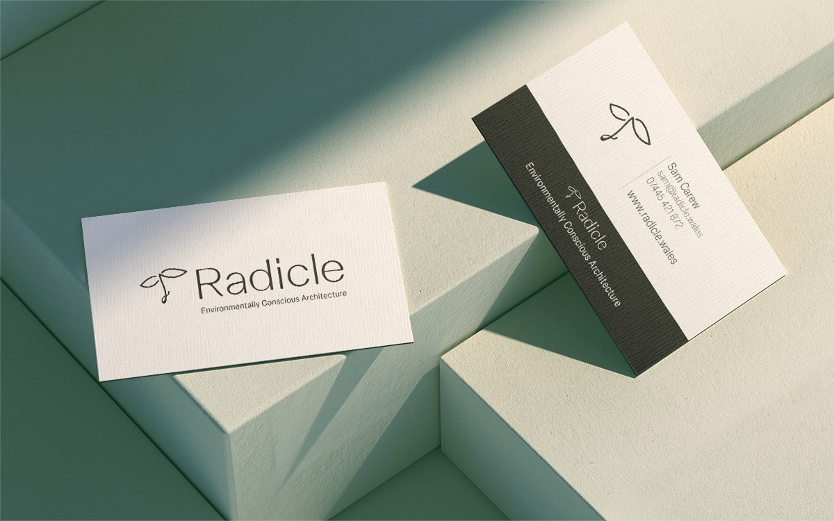
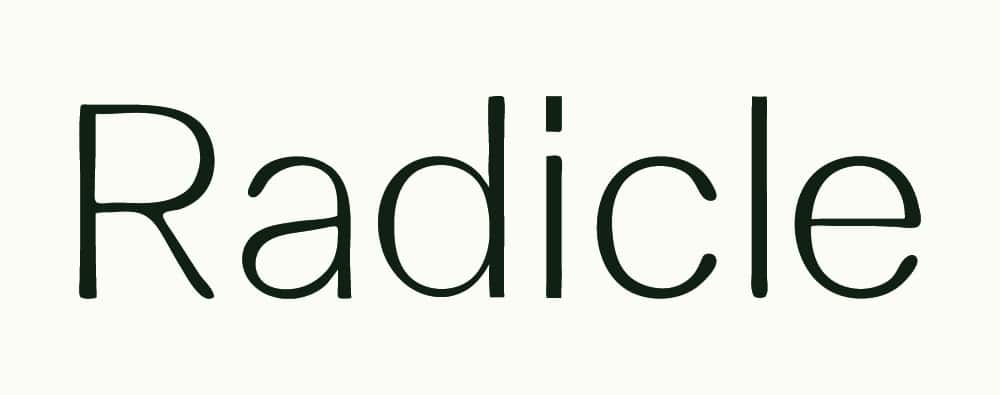
The typography
The custom typography also takes an organic form that feels unrefined and idiosyncratic, which in turn is a reference to sustainable materials and biophilia.
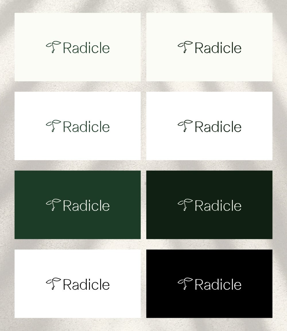
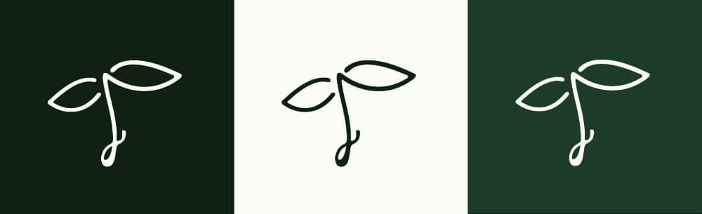
Brand Brook
A brand book was developed out to guide consistent brand values and aesthetics across medias.
_
Showcase